Introduction
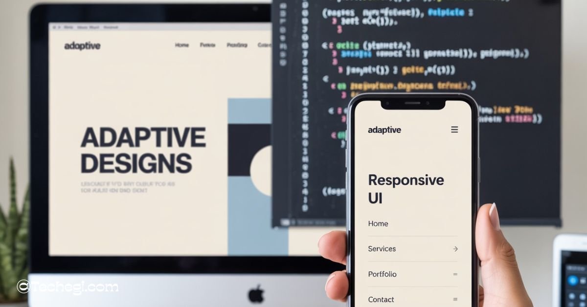
As mobile web usage continues to dominate, delivering a seamless experience across all devices has become increasingly important. Whether you’re managing a business website or a personal blog, ensuring that mobile users see content optimized for their screens is critical. One way to enhance the mobile user experience is by utilizing a media query to redirect users on mobile devices.
But here’s the catch: CSS media queries alone can’t handle redirection. Instead, developers must pair them with JavaScript or server-side logic. In this comprehensive guide, we’ll break down how media queries work, explain why mobile redirection is essential, and provide guidance on how to implement it correctly for your site. From browser-based techniques to SEO best practices, this article covers everything you need to know to redirect users based on device screen size.
What Is a Media Query to Redirect on Mobile?
A media query is a CSS technique that allows for the application of styles based on the characteristics of a user’s device, such as screen width, height, orientation, and resolution. Media queries help developers create responsive media queries for all devices that adjust to different screen sizes.
However, the term media query to redirect on mobile refers to using these breakpoints to trigger JavaScript or server-side scripts that redirect users to a mobile-friendly version of a website. While CSS detects the screen size, the actual redirection must be performed using other technologies, such as JavaScript or PHP.
This method is handy for websites that maintain separate URLs for desktop and mobile devices (e.g., example.com and m.example.com). It ensures users land on the version most appropriate for their device — whether it’s an iPhone, Android, or tablet.
CSS Media Queries & Breakpoints
Media query redirect on mobile CSS is one of the most searched terms because many developers try to use CSS alone for redirection. However, while CSS can detect screen size, it cannot execute redirection. You’ll still need JavaScript or a server-side script.
Media queries allow developers to define breakpoints, which are screen-width thresholds that dictate when specific styles should be applied. The most common mobile breakpoint is:
@media only screen and (max-width: 768px) {
/* Styles for tablets and smaller devices */
}
Some popular breakpoints include:
| Device Type | Max-Width |
| Smartphones | 480px |
| Tablets | 768px |
| Laptops | 1024px |
| Desktops | 1200px+ |
These breakpoints are used to adjust layout, font size, images, and more. Although media queries help render content correctly, they can’t redirect users on their own. That’s why developers use them as a trigger alongside JavaScript.
How to Use Media Query Redirect on Mobile
Using a media query redirect on mobile HTML page involves detecting the screen size using JavaScript and executing a redirect. This section provides practical implementation examples that combine HTML and JavaScript for redirection.
Here’s a simple example using HTML and JavaScript:
<script>
if (screen.width <= 768) {
window.location = “https://m.example.com”;
}
</script>
This script can be placed within the <head> section of your HTML document. This approach is common when developers use media query redirects on mobile HTML in conjunction with client-side scripts.
Benefits of Redirecting Users to Mobile with Media Queries
Using a media query to redirect on mobile enhances the user experience by ensuring that visitors see the version of the site that’s optimized for their device. Other key benefits include:
- Faster Load Times: Mobile sites often have lighter assets and simpler layouts.
- Improved Navigation: Mobile interfaces can prioritize buttons and vertical scrolling.
- Increased Engagement: Content tailored to the mobile experience keeps users on-site for more extended periods.
- Better Conversion Rates: Optimized pages make it easier for mobile users to take action.
Whether the user is on an iPhone, Android device, or another mobile platform, tailoring the experience enhances performance and accessibility.
Client-Side: JavaScript + Media Queries
To implement a media query redirect on mobile, most developers use JavaScript to check screen size and then trigger a redirect. Here’s a simple example:
if (screen.width <= 768) {
window.location = “https://m.example.com”;
}
For more precise control, use the media query redirect on the mobile JavaScript method window.matchMedia():
if (window.matchMedia(“(max-width: 768px)”).matches) {
window.location.href = “https://m.example.com”;
}
You can also add event listeners to detect screen changes dynamically:
const mq = window.matchMedia(“(max-width: 768px)”);
mq.addEventListener(“change”, (e) => {
if (e.matches) {
window.location.href = “https://m.example.com”;
}
});
These scripts are embedded in the <head> of the HTML or in an external JavaScript file.
Why CSS-Only Can’t Redirect: The Need for JS or Server Logic
While CSS media queries are ideal for styling, they lack scripting capabilities. That means:
- They can’t change the page URL.
- They can’t execute functions or events.
- They are read-only rules that adjust visual layout.
To redirect users, you must use:
- JavaScript (client-side)
- PHP, Python, Node.js (server-side)
Trying to execute a media query redirect using a mobile CSS approach will not work without JavaScript or backend logic.
Server-Side vs Client-Side Redirection
Redirection can also occur on the server by detecting the device type using the User-Agent string.
Comparison Chart:
| Criteria | Client-Side (JS) | Server-Side (PHP/Apache) |
| Speed | Slightly slower | Faster if optimized |
| Control | High (dynamic) | High (early redirect) |
| SEO-Friendly | Can be problematic | Preferred by search engines |
| Maintenance | Easier | Slightly more complex |
Server-side redirection is better for SEO and performance, but client-side is easier to implement and test.
Modern Techniques & Polyfills
Modern redirection methods combine responsive design with fallback tools to ensure broader compatibility. You can use:
- Polyfills like css3-mediaqueries.js to support older browsers.
- Adapt.js and enquire.js for advanced media query handling.
- Responsive frameworks like Bootstrap to reduce the need for redirects altogether.
You can even tailor redirection based on mobile landscape media query by checking screen orientation:
@media only screen and (max-width: 768px) and (orientation: landscape) {
/* Specific styles or triggers for landscape */
}
Best Practices & Common Mistakes
Best Practices:
- Always test redirection on multiple devices.
- Redirect to a fully functional mobile version, not a limited or stripped-down page.
- Use relative paths if your mobile site lives on the same domain.
Common Mistakes:
- Using outdated breakpoints that don’t reflect modern devices.
- Creating redirect loops by improper detection scripts.
- Forgetting to set canonical tags leads to duplicate content penalties.
Avoiding these pitfalls will ensure a smoother, more professional user experience.
SEO Checklist for Mobile Redirection
If you’re using redirection for mobile users, make sure you follow Google’s mobile-friendly guidelines.
Mobile Redirection SEO Checklist:
- Use a 302 redirect for temporary and a 301 for permanent redirection.
- Implement canonical tags on both versions of your site.
- Keep desktop and mobile content consistent to avoid cloaking issues.
- Test URLs using Google Search Console’s Mobile Usability Tool.
- Ensure robots.txt doesn’t block the mobile site.
Search engines prioritize mobile-first indexing. Done incorrectly, mobile redirects can harm your rankings instead of benefiting them.
Ready-to-Use Code Samples
Here’s a quick reference of the most effective code snippets:
Basic JS Redirect Based on Screen Width:
if (screen.width <= 768) {
window.location = “https://m.example.com”;
}
Modern MatchMedia Example:
if (window.matchMedia(“(max-width: 768px)”).matches) {
window.location.href = “https://m.example.com”;
}
Server-Side PHP Redirection:
if (preg_match(‘/Mobile|Android|iPhone/’, $_SERVER[‘HTTP_USER_AGENT’])) {
header(‘Location: https://m.example.com’);
exit;
}
These examples can be customized to suit your website’s structure and requirements.
Testing Your Mobile Redirection
Proper testing ensures your redirection logic is reliable. Use these tools:
- Google Chrome Developer Tools – Emulate mobile devices and inspect behavior.
- BrowserStack or LambdaTest – Test on real devices in different locations.
- Google Search Console – Check for mobile usability errors.
- Network Throttling – Test page load times under various bandwidth conditions.
Never assume a script works universally—devices vary, and regular testing is key to stability.
Wrap-Up: Mobile-First with Media Query to Redirect on Mobile
In today’s digital landscape, a mobile-first strategy is more than just a trend—it’s essential. Using a media query to redirect on mobile empowers you to deliver content that fits perfectly on any device. Although CSS alone can’t handle redirection, combining media queries with JavaScript or server-side scripting provides a robust solution.
Done correctly, this approach improves load time, boosts user engagement, and enhances SEO performance. From smart code samples to modern libraries and proper testing, this guide equips you with everything needed to implement mobile redirection effectively.
FAQ’s
1. Can I use only CSS to redirect a mobile user?
No, CSS media queries are limited to styling and cannot redirect users. You need JavaScript or server-side scripting for actual redirection.
2. Will mobile redirection affect my SEO rankings?
If implemented correctly with canonical tags and proper redirect codes, it can improve SEO. Misconfigured redirects, however, may harm rankings.
3. What’s the best breakpoint to use for mobile redirection?
A common breakpoint is 768px or lower, which typically targets tablets and smartphones.
4. Is it better to have a separate mobile site or use responsive design?
Responsive design is preferred today, but if you manage separate mobile URLs, redirection ensures the right version is served.
5. How do I stop redirection loops between mobile and desktop?
Always include a detection condition to prevent re-redirecting a user who is already on the correct version of the site.
Also read:
- Rent to Own Mobile Homes: Affordable Ownership Options!
- Florida Mobile Axe Throwing Miami Trailer Guide!
- Mobile Cars: Driving the Future of Smart Mobility!