
In today’s fast-paced world, the success of any presentation relies heavily on how well it captures and holds the audience’s attention. Audiences are conditioned to expect not just information but also an engaging visual journey that makes learning both effortless and enjoyable. Leveraging PPT generator technology can streamline the design process and ensure your slides make a powerful impression at first glance. Modern design principles can transform uninspired slides into compelling, memorable presentations. By adopting established strategies for minimalism, typography, color, visual hierarchy, and more, presenters can ensure their message is not only heard but also remembered and acted upon.
The quality of your slides can make the difference between communicating a clear, engaging message and causing unnecessary confusion. Whether you are pitching a new idea, educating an audience, or inspiring a call to action, focusing on how your content is visually presented is just as important as the message itself. Robust design elements draw viewers toward the most important points, providing clear direction to your narrative and promoting greater audience retention. Backed by behavioral science and the latest trends, modern design tools and frameworks equip anyone to build compelling presentations, regardless of technical experience.
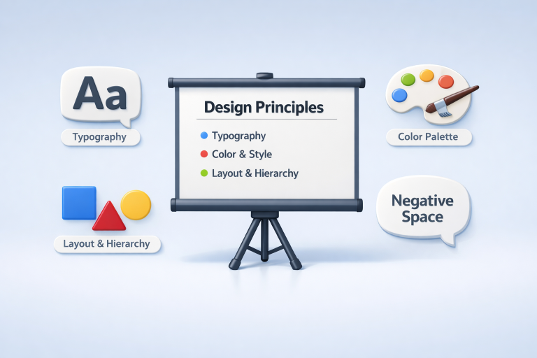
Embrace Minimalist Design
Minimalism in presentation design is all about reducing visual noise so your core message stands out. Uncluttered slides, ample spacing, and a strategic use of visuals help your audience focus on the key information you deliver. Try to eliminate unnecessary graphics and excessive text. Instead, use one clear point per slide to prioritize readability and reinforce clarity. When content is concise, attendees find it much easier to engage and follow along.
Choose Readable Typography
The selection of typefaces can have a significant effect on how your audience receives information. For most online or projected presentations, sans-serif fonts such as Arial or Helvetica typically offer the highest readability. Limiting your font selection to two consistent styles (for example, one for titles and another for body text) maintains a professional appearance and keeps distractions to a minimum. Also, be mindful of contrast and sizing; always ensure that text can be read from every area in the room or screen. Consider using size and weight variations to create emphasis rather than introducing new fonts. The more uniform your typography, the easier it is for your viewers’ eyes to navigate each slide and retain your message.
Utilize Color Psychology
Smart color choices go well beyond aesthetics. Every shade evokes an emotional response and helps shape how your message is interpreted. Blues often instill feelings of trust and professionalism, ideal for corporate settings, while energetic reds signal urgency or excitement. A consistent palette, with accent colors reserved for highlights and calls to action, prevents distraction and helps guide the audience’s eye. With intentional selection, colors can reinforce your content, evoke feelings, and subtly urge your audience to take the next step.
Establish Visual Hierarchy
Arranging information by priority is essential for audience comprehension. Establish hierarchy by manipulating font size, weight, and color so the headline reads naturally first, with supporting details following. Bulleted or numbered lists divide complex material into simple, digestible points. Well-placed alignment and uniform spacing prevent cognitive overload and direct attention efficiently.
Leverage Negative Space
Negative space, sometimes called white space, provides breathing room around your content and helps focus attention where it matters most. Cramming a slide with too many elements increases mental fatigue and slows down learning. By balancing text and imagery with sufficient open space, your presentations appear more polished, sophisticated, and effortlessly captivating.
Maintain Consistency
Consistency in your presentation design is vital for building credibility. Stick to a harmonious color scheme, repeat fonts, and match layout grids across slides. Consistency creates predictability, letting your audience relax and focus on your ideas rather than getting distracted by jarring transitions or shifting formats. Crafting a simple style guide before you build your slides can dramatically improve your workflow, ensuring every detail reinforces your professional message.
Incorporate Storytelling
Every great presentation tells a story with a beginning, middle, and end. Structure your content to unfold logically, using triggers like real-world anecdotes, metaphors, and case studies that your audience can relate to. Stories humanize even the most technical data, foster emotional connections, and make complex ideas stick. The narrative arc energizes your talk and makes your message easier to recall and more likely to inspire action.
Enhance with Interactivity
Adding interactive elements can dramatically boost engagement. Use clickable links, live survey tools, quizzes, or embedded videos to transform viewers from passive recipients into active participants. However, always ensure that interactivity enhances, rather than disrupts, the core flow of your content. Well-designed interaction increases learning, highlights essential points, and fosters a sense of collaboration within your audience. Integrating these modern design principles will help you craft presentations that not only impress visually but also communicate with far greater impact. By prioritizing simplicity, readability, consistency, and engagement, every presenter can leave a lasting mark on their audience.
Conclusion
Effective presentations are built on clarity, strategy, and audience engagement. By embracing minimalist design, you reduce distractions and highlight key messages, while readable typography ensures your content is easily absorbed. Thoughtful use of color psychology and visual hierarchy guides attention and reinforces meaning, and leveraging negative space enhances focus and sophistication. Consistency across slides strengthens credibility, and incorporating storytelling turns information into memorable narratives. Adding interactive elements further engages your audience, transforming passive viewers into active participants. By combining these principles with modern tools like AI-powered presentation generators, presenters can craft slides that are visually compelling, emotionally resonant, and highly effective, ensuring every message is not only understood but remembered and acted upon.